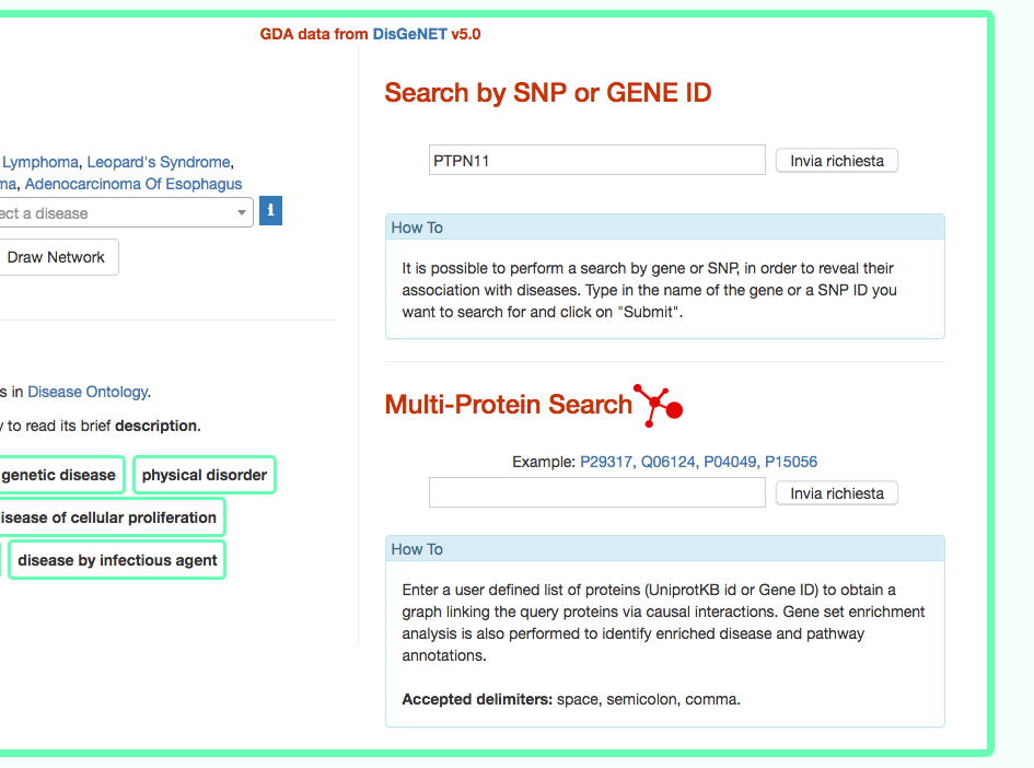
- Filtering the information
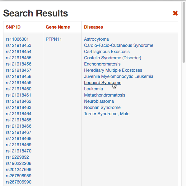
DISNOR, returns a pop-up window which is organized as a Table. The first column contains the Id of the query genetic variant. By clicking the refSNP ID (e.g. rs11066301), it is possible to access the information related to the genetic variant as annotated at dbSNP.
The second column contains the gene name of the gene linked to the query genetic variant. The gene name is hyperlinked to the SIGNOR page of the entity (in this case PTPN11).
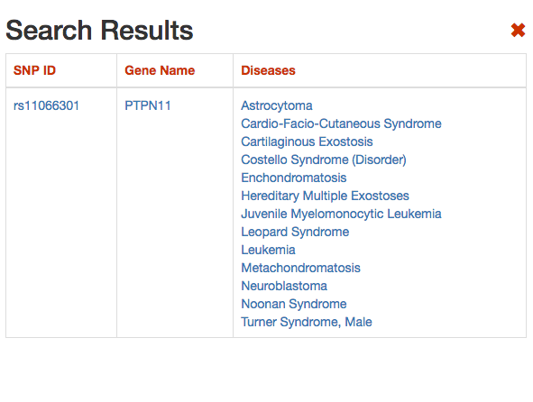
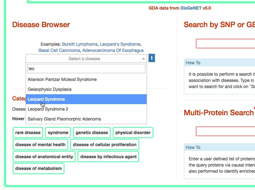
The third column provides the list of diseases in which the gene variant was observed to be enriched in GWAS studies. By selecting a disease (e.g. Leopard’s Syndrome), it is possible to recall the disease page in DISNOR (see next step).
- Exploring the disease page
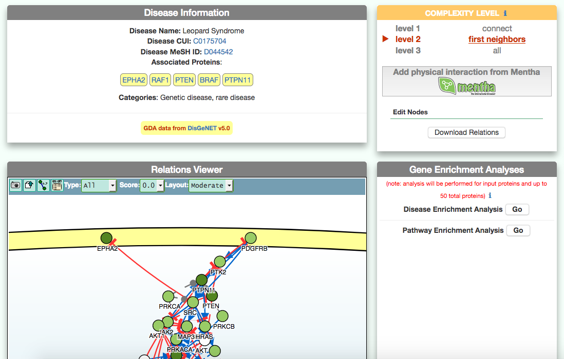
The disease page in organized in four frames: ‘Disease information’ summarizes disease details, such as name, classification, list of genes associated to the disease according to DisGeNet, and links to NCI Metathesaurus and to MeSH terms associated to the pathology; ‘Relations Viewer’ offers a schematic and detail-rich representation of the causal interactions between the disease associated genes; ‘Complexity Level’ which allows to retrieve and display interactions related to the disease-associated genes (‘seeds’) at different level of complexity; ‘Gene Enrichment Analysis’ allows to compare the overlap between the list of seed genes and the genes associated to all the remaining diseases or to the list of genes associated to pathways (according to KEGG).
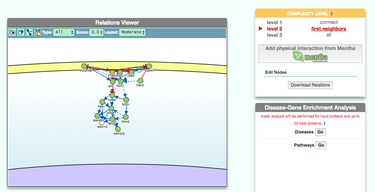
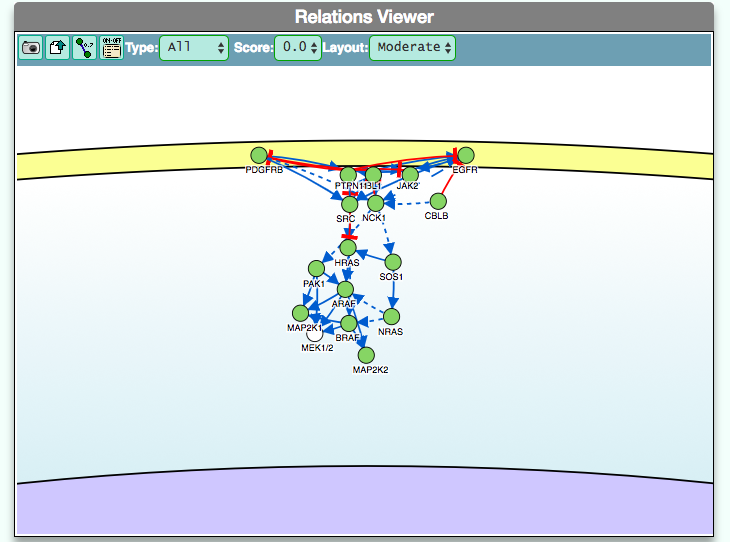
- Using the graphic visualizer
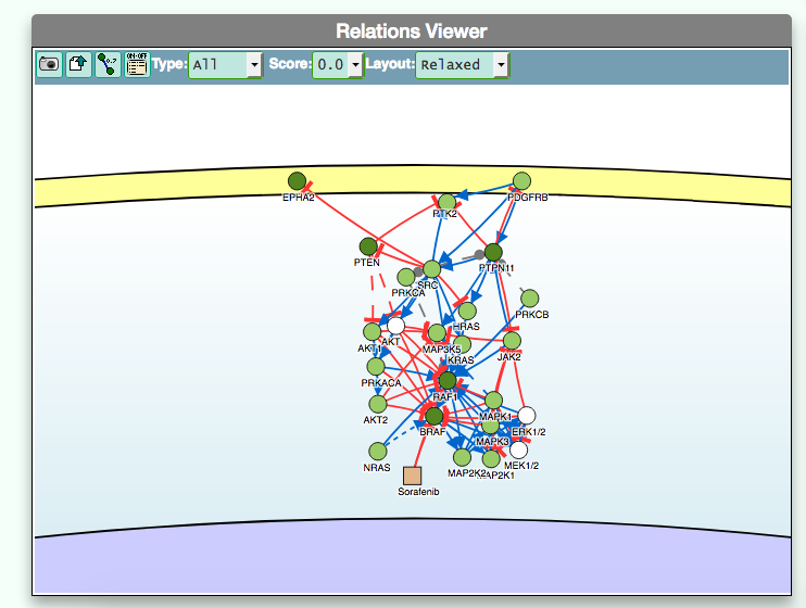
The graphic visualizer in an interactive graph viewer, where nodes are proteins (or other entities considered in SIGNOR) and edges illustrate the causal relationships between them. The graphic visualizer yields a dynamic, customizable display of the retrieved interactions, whose attributes are summarized with the use of symbols and color codes: direct interactions are displayed as solid lines and indirect ones as dashed lines, while edge color and arrow shape represent the effect (up- or down-regulation): up-regulations are represented as blue arrows, while down-regulations as red ‘T-shaped’ arrows. Nodes also have a color and shape code. The nodes that are used to query the SIGNOR database to retrieve the interactions that form the graph are small dark-green circles, while first neighbours are light green . White circles and blue clover leaves represent protein families and complexes respectively. Yellow squares represent small molecules and chemicals, while phenotypes and stimuli are rectangles.
Proteins, small molecules, stimuli, phenotypes and other entities are spatially organized in four main cellular compartments: the extracellular space, the plasma membrane, the cytoplasm and the nucleus, according to their manual annotation. Nodes can be manually moved by the user to obtain a customizable layout of the entities. Every relationship is linked to a score, based on literature co-occurrences.
After clicking on a node a pop-up window displays the entity details: name, external accession number (e.g. UniprotAC, PubchemID), chemical inhibitors and link to the related SIGNOR page.
By clicking on each edge it is possible to obtain details about the interaction: the mechanism (e.g. phosphorylation, binding…), the cell line or organism in which the interaction has been observed, the reference and the sentence supporting the interaction.
By clicking on symbols on the upper bar of the visualizer it is possible:
-
take a screenshot of the graph;
-
download data underlying the graph representation;
-
show or hide the interaction score;
-
show or hide the graph legend;
-
filter the type and the effect of the interactions or include/hide small molecules or chemical compounds;
-
select an edge score threshold;
-
select a type layout among ‘compact’ (where nodes are in close proximity), ’moderate’ and ‘relaxed’ (where nodes are more far apart) layouts;
-
Visualizing the pathway at different level of complexity
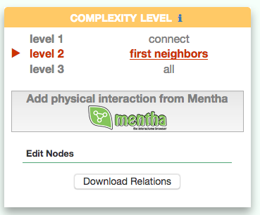
The box allows the user to display interactions at different level of complexity using three different query strategies to retrieve interactions from the SIGNOR database: ‘Connect’ (Level 1) searches for signaling interactions involving only any two entities in the query list; ‘First Neighbours’ (Level 2) is a multi-step strategy that initially performs a search in SIGNOR for all interactions involving any of the seed entities, next prunes nodes with degree-one; and ‘All’ (Level 3) allows access to signaling interactions involving any of the seed entities and all the remaining proteins in the SIGNOR network without any further filtering. By default the visualizer displays Level 2 interactions (‘First Neighbours’); if no interaction is retrieved at level 2 then level 3 is shown;
By clicking on ‘Add physical interactions from Mentha’ the user can include in the graph also protein-protein interactions from the mentha database (http://mentha.uniroma2.it/) involving any seed entities and filtered by score. Only interactions whose reliability score is higher than 0.4 are shown;
It is also possible to select ‘edit nodes’ to consult and edit the list of the seed entities, by removing or adding nodes.
By clicking on ‘Download Relations’ it is possible to download all the interaction visualized in the viewer (note: this does not include mentha interactions).
-
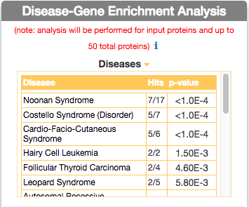
Identify similar diseases
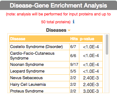
To identify diseases having some degree of similarity with the query disease (i.e Leopard’s Syndrome), go to ‘Disease-Gene Enrichment Analysis’ frame and click the “disease” GO button. The algorithm compares the list of genes that are displayed in the disease graph with the lists of the disease genes of any other disease in DISNOR. NOTE: to limit server overload, a maximum number of 50 proteins will be used as input for each gene list in this analysis.
The tool returns a table showing the 20 diseases that have a higher degree of similarity (a lower p-value of the observed overlap with query gene list) .
For each disease pair (the query one [e.g. Leopard’s Syndrome] versus identified one [e.g. Costello Syndrome]) the tool returns, in the ‘Hits’ column, the ratio of shared genes (calculated, for instance, as the number of ‘Costello Syndrome’ associated genes that are also associated to ‘Leopard’s Syndrome’, over the total number of ‘Costello Syndrome’ genes). The ‘p-value’ column shows the p-value calculated with a randomization test.
-
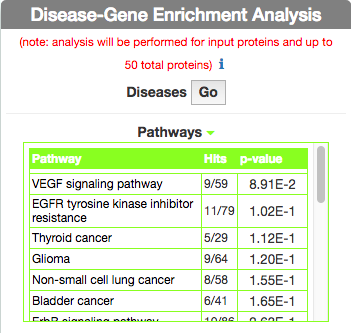
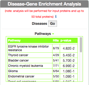
Identify Pathways most represented in a disease gene list
To identify pathways in KEGG that are enriched in the seed gene list of the query disease (Leopard’s Syndrome), go to the ‘Disease-Gene Enrichment Analysis’ frame and to ‘Pathways’ and click the ‘GO’ button. The algorithm compares the list of genes that are displayed in the disease graph with the lists of pathway genes as annotated in the KEGG database NOTE: to limit server overload, a maximum number of 50 proteins will be used as input for each gene list in this analysis.
The tool returns a table showing the KEGG pathways that are most represented in the query disease gene list. For each pathway, in the ‘Hits’ column, the tool returns the ratio of shared genes (calculated, for instance, as the number of ‘VEGF signaling pathway’ genes that are also present in ‘Leopard’s Syndrome’, over the total number of ‘VEGF signaling pathway’ genes). The ‘p-value’ column provides the p-value calculated with a randomization test.